Dive Brief:
- Anthem Worldwide received a 2017 silver Pentaward for its design of a limited edition box of Kellogg’s cornflakes. The design gives the brand’s iconic rooster Cornelius a makeover, as Kellogg Canada recognizes the Chinese year of the rooster.
- Equator Design received a 2017 bronze Pentaward for the redesign of the entire line of packaging for Sam’s Club's private label brand, Member’s Mark, which features 300 products including grocery items, health and wellness items and apparel.
- A decade after handing out its first trophies, the Pentawards has become the most prestigious international competition exclusively devoted to packaging design.
Dive Insight:
Trading in his bright green feathers, Cornelius, the iconic rooster donned ceremonial red and gold for his appearance on limited-edition boxes of Kellogg’s Cornflakes on 2017 as part of Kellogg Canada's marketing efforts aimed at introducing the brand to Chinese Canadians.
The packaging, along with Kellogg Canada’s participation in a campaign to welcome newcomers to Canada, comes as the cereal maker tries to find a new generation of families who may not be as familiar with the product.
Once a staple at the breakfast table, consumption of cold cereals has declined as consumers forego breakfast or choose more portable options. By offering an iconic American cereal in a package that might remind them a little bit of home, the year-long campaign may help Kellogg connect with new customers.
For its winning redesign of Sam’s Club's Member’s Mark label, Equator Design likely drew from past experience.
In its redesign of product label packaging for Roundy’s Supermarkets, Equator wanted to grow a private label into a private brand. The goal, according to the company, was to take “it from a functional design to a design that injected personality and uniqueness into each category sector [and] make the familiar more favored and purposeful for shoppers to encourage buy–in and trial.”
Specifically, the design firm’s strategy for Roundy’s included disrupting the category, maximizing personality in each category, holding the brand together with the logo, challenging national brand offerings and raising quality. Equator likely had similar goals for Sam’s Club’s private label brand, which the Walmart-owned company says it will continue to expand in coming years.
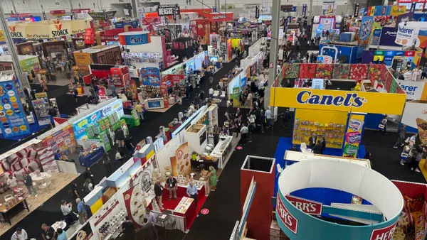
Once considered the less attractive option compared to national brands, products made for individual stores have been improving both their value and quality. Developing a unique look has become important to private label products for stores such as Sam’s Club, Trader Joe’s and Safeway as they work to deepen relationships and establish loyalty among consumers.
While much of the attention is directed at the food itself, packaging with unique designs, bright colors and eye-popping images can improve brand identity and communicate the product's message to the consumer. And they can make a product seem more premium, allowing it to be sold at a higher price. Increasingly, packages communicating messages such as freshness, clean ingredients or sustainability are being sought after by consumers, and companies that introduce new products or reformulate old ones are smart to promote these changes to shoppers.
According to Nielsen, 63% of consumers say renewable packaging is a key driver in purchase decisions. One way packaging can enhance consumers’ perception of a product is by tapping into the growing desire for stronger connections with brands that promote sustainability and corporate responsibility.
“Packaging is one way food and beverage brands can grab a new customer’s attention on real and virtual store shelves or through social media,” Chris Gretchko, vice president of marketing for Tetra Pak US & Canada, told Food Dive last year. “In this cluttered landscape, the right packaging is as important as the contents inside. And as we know, brands have just a few seconds to make an impression, so it had better be bold.”
The food industry is riddled with scores of recent successful packaging overhauls. Coca-Cola's Fanta has introduced a new spiral bottle that looks as if it's been twisted by hand. Nutella used algoritims to create a limited-edition of collectible jars in a variety of eye-catching colors, shapes and patterns, including zig-zags, polka dots and splotches. The 7 million different packaging designs sold out within a month. Nestle's Lean Cuisine redesign helped drive a sales increase of $58 million in the following year. And Halo Top has become the #1 seller of pint ice cream in the U.S. due in part to a simple product that prominently displays the calorie count right on the front of the container.
While attention will continue to be focused on what's inside the package, companies are unlikely to forget that what's on the outside matters to consumers and, ultimately, sales of the brand. As a result, Big Food makers are likely to continue making changes to their packaging that helps the brand stand out and better resonate with shoppers.