Jared Powell is CEO of Frontier Label, a fully adhesive custom label company. With more than a decade of leadership and a background in bio-engineering, he has developed a workplace and culture that values problem-solving and growth through purpose, excellence and investing in others.
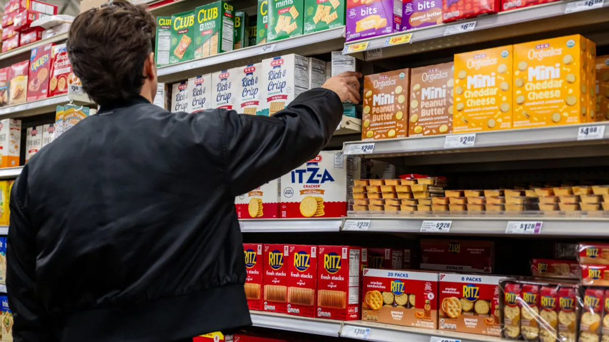
The American coffee market is valued at almost $13 billion, but is dominated by large brands such as Folgers, Dunkin’ Donuts and Starbucks. One surefire way for smaller brands to stand out is through the use of impactful packaging.
Despite the amount of work that goes into roasting, incorporating smart designs in labeling and packaging may be the next most crucial step in marketing a product. About one third of consumer purchase choices are based on packaging alone. Just look at Terrelli’s Coffee, which saw a 25% increase in sales after changing its packaging.
The exterior of a good roast is oftentimes a consumer’s first look into a specific brand, so capturing the essence of the taste in physical elements is imperative. For consumers, a strong visual can promise a strong roast, while a weak aesthetic can be linked to a lackluster taste. Hex Coffee, for example, has attested to how its rigid box created a minimal and elegant aesthetic, leading customers to hold Hex to a higher standard and treat the product with care.
For similar results, some aspects to keep in mind during the design process are leveraging trending themes, carefully choosing fonts, and implementing colors and textures that create a full experience.
Leverage trending themes
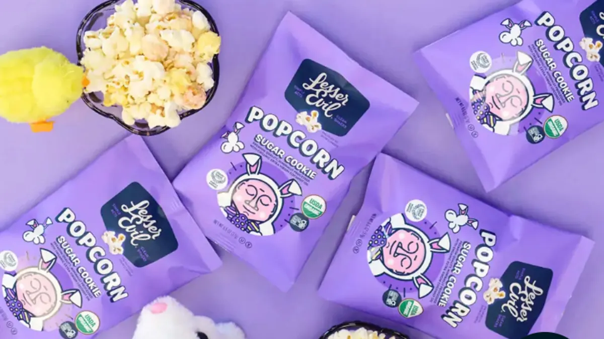
It’s no surprise that certain trends can be seen throughout the packaging and labeling world – from retro to metallic. Key to standing out among the crowd is incorporating themes that are timely, and reflect the current wants and needs of the modern consumer.
In a fast-paced world, consumers do not want to spend time figuring out what is being sold to them – they want to know within a matter of seconds. As such, simple and clean designs are seeing increased popularity as they make comprehension more efficient for potential buyers. Incorporating an easily digestible theme that stays true to the roots of the roast is a surefire way to ensure positive brand reception.
Carefully choose font
One of the make-or-break decisions for brands is the font that they incorporate. Some brands opt for ornate typography, but without a deep understanding of the customer base, this can be a mistake.
Fonts evoke different emotions in specific people, and therefore affect the way people perceive a product or brand. Courier fonts, for example, can resemble old memos, while sans-serif fonts are viewed as informal and playful.
If your desired image is rustic, showing a long history in coffee roasting, it’s probably best to choose a rustic font, like Playbill, that reflects that background. On the flip side, if you are a newer brand appealing to millennials, a lighter, more modern font, such as Komoda, may be more appropriate.
Implement textures and colors that tell a story
Similar to fonts, textures and colors can have an emotional effect on how brands are received. Coffee is a sensory experience from aroma to taste, and capturing the roast through haptics and color is a way for roasters to stand out and give consumers a taste of the brand before purchasing.
The feel of burlap packaging or stone paper labels can signal that a roast focuses on a natural feel and has a rich history. A smooth, plastic packaging can communicate a sleeker, more modern brand.
Similarly, the strategic use of color can point to the history, or even the brand personality. For example, founders Spoorthi Kumar and Anand Patel of Hidden Grounds Coffee grew up in India, surrounded by bold spices and vibrant colors. As a result, the coffee roaster chose a bold label accentuated with a goldish yellow to show off its history, present and future simultaneously.
Roasters put a lot of time and energy into developing a high-quality product, but getting that product off the shelf can prove difficult in such a highly saturated (and dominated) market.
Fortunately, there are ways to stand out amongst bigger competitors, such as getting ahead of trends and wisely choosing appropriate fonts, textures and colors. The biggest takeaway is to make sure that all visual elements of a roast are cohesive and tell an overarching story that is easily recognized by consumers and promises an experience beyond a cup of joe.