Dive Brief:
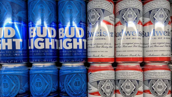
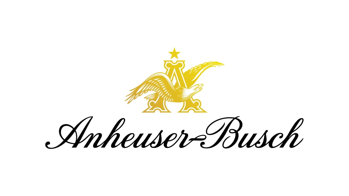
- Anheuser-Busch has updated its visual identity and logo, rendering its "A&Eagle" in a gold that mirrors the color of beer and barley, according to a press release.
- The logo, which features the eagle in flight and facing to the right, is intended to be more premium and forward-looking than before, reinforcing the company's new global purpose, "To a Future with More Cheers."
- One of the key tenets of the alcohol giant's new global purpose, the company said, is fostering innovation in its portfolio, as it continues to expand its portfolio of beverages to include non-beer products favored by younger consumers like hard seltzer, hard soda, and low- and no-alcohol products.
Dive Insight:
Anheuser-Busch's update of its visual identity and iconic "A&Eagle" logo allows the beverage marketer to highlight the new global purpose it first unveiled in December. The new logo is the next step in the company's renewed focus on consumer-centricity and a commitment to innovation, according to Anheuser-Busch CEO Brendan Whitworth.
In its most recent earnings report, parent company Anheuser-Busch InBev reported that its top-line growth improved on a year-over-year and two-year basis, ahead of pre-pandemic levels and despite ongoing challenges from COVID-19 and supply chain issues. CEO of Anheuser-Busch Inbev SA/NV Michel Doukeris attributed the momentum to the company's "relentless" execution, investment in brands and accelerated digital transformation.
Whitworth, in a statement, underscored how the new logo is the next iteration in the company's evolution.
"We have the opportunity to accelerate our momentum and positively impact even more people, and this evolution of our visual identity helps reflect the ongoing transformation of this great company," Whitworth said in the press release.
The forward-looking logo was designed to combine the company's storied heritage and its plans for the future. Countless CPG brands have rebranded during the last two years to build on pandemic-spurred gains, often updating familiar elements to split the difference between the past and future. In a similar move, the Campbell Soup Company subtly redesigned its iconic can labels while embracing ideas like comfort, goodness and Americana that have been associated with the brand for decades.
Anheuser-Busch's new global plan includes a 10-year commercial strategy that seeks to create growth and value with consumers and partners, both across its supply chain and in communities it serves.
The purpose-driven plan also touches on sustainability, a priority for major marketers which the company previously outlined with its 2025 sustainability goals initiative, and its "leading role" in the country's economic recovery, especially as on-premise sales continue to be affected by pandemic-related issues and closures.
The rebrand follows Anheuser-Busch's recent shuffling of its U.S. leadership team, with Benoit Garbe promoted from U.S. chief strategy officer to U.S. CMO, among other moves. The changes in leadership came as the company put a higher premium on using data-driven research to drive aspects of its media strategy, including direct-to-consumer initiatives and digital transformation.