Dive Brief:
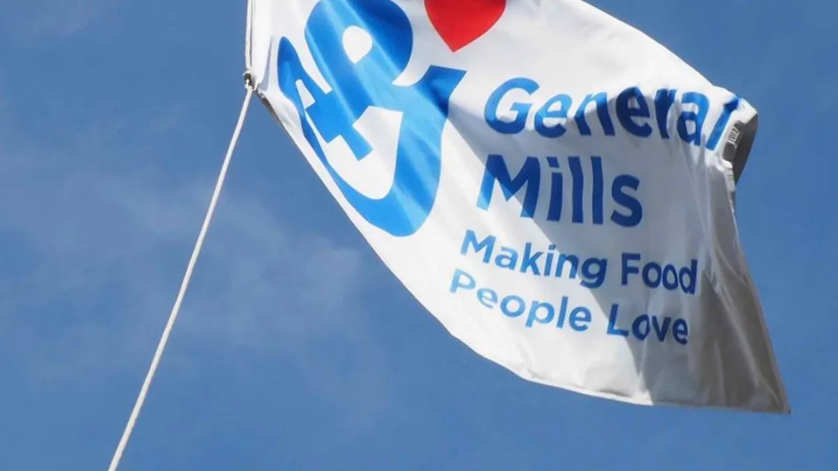
- General Mills is debuting a new logo with its familiar blue cursive “G” and a new red heart, along with the words “General Mills: Making Food People Love," according to Food Business News. The new look has already been adopted on the company's social media sites and at locations worldwide.
- The CPG giant last updated its logo in 2001 following the acquisition of Pillsbury. This is now the sixth change for the company since 1928.
- “With our newest logo, the familiar ‘Big G’ continues to exemplify strength, longevity and trust — and now love,” the company said.
Dive Insight:
It’s been 16 years since General Mills last updated its logo, and it's now showing it a little love. Unlike the change in 2001, this modification has nothing to do with a major acquisition. Rather, its image is getting a facelift to reflect changing consumer tastes.
The new look for General Mills keeps its familiar large cursive blue “G,” but adds a small red heart above the signature letter. The new company motto also is reflected: “General Mills: Making Food People Love.”
At first glance, it would appear the company is trying to be inclusive and heartfelt with its new branding. The red heart is an interesting addition. General Mills says it represents love, but consumers also may identify it as a marker by the American Heart Association of heart-healthy foods. A red heart is often used in marketing and on menus to denote certain items as better-for-you; a connotation likely not lost on General Mills.
The new logo could conger up a feeling that General Mills, known for its Nature Valley granola bars, Annie's organic, Yoplait yogurt and its iconic cereals, has a healthier roster of brands — a challenge plaguing large food companies struggling against smaller, more nimble upstarts who seem to be in tune with consumer demands. But it likely won’t move the revenue needle in a significant way.
Companies often like to tweak a logo to communicate a message or show consumers there is more to the business. In 2015, Kraft Heinz debuted a new logo shortly after the completion of the merger that brought the two brands together.
Earlier this year, Tyson Foods debuted a new corporate logo, along with announcing its plans for the future. The Tyson chicken logo, which consumers are familiar with and can easily identify in the refrigerated poultry section at the supermarket, remains the same.The corporate logo is a clear departure from the red and yellow stamp still being used by the retail chicken brand. The updated image features a navy background with a white “T” monogram hovering over a slimmer typeface version of “Tyson.” Company executives are likely trying to distinguish Tyson Foods from the poultry it sells to show consumers there is more to the business than just chicken.
In the case of General Mills, it's not completely overhauling its image. The familiar "Big G" remains, just with a little tweaking. It’s important for consumers to still be able to identify the core brand, but at the same time know that there's more to the firm than what they may be intimately familiar with.