You know the feeling. One day, the same person that you see every day looks—well, a little different. Something has changed. Maybe it's a new hairstyle or a new item of clothing. But suddenly they look better. And you fall in love all over again.
Packaging changes how we see things. And that change in appearance can lead to a resurgence of affection. Or, in the case of foods and beverages, it can lead to a jump in sales. Companies do have to be wary, though, because in some instances, changes can also prompt suspicion.
Here are five packaging changes from across the globe that turned our heads this year—for better or worse.
1. CRUNCHY NUT
Who doesn't want to be a little bit taller and a little bit thinner? The desire to be long and lean is fairly common. So we can't really hold it against Kellogg's when they decided to change the packaging of Crunchy Nut cereal. Still, the cynic in us assumes that the redesign had nothing to do with looking better. Because it turns out that the tall and slim box holds one ounce less food—but sells for the same price.

2. JIM BEAM
Jim Beam, the Kentucky bourbon brand that's been around since 1795, decided to revamp its look for the first time in more than a decade. The repackaging effort started during the summer with the roll out of a new look for its popular bourbon and cola ready-to-drink cans. The cans, white with red accents, are designed to emphasize the Jim Beam name while giving the brand a more modern look.

3. ABSOLUT
Jim Beam wasn't the only liquor to adopt a new look. Absolut completed a the redesign of its flavored vodka bottles. (The company started with a packaging redesign last year for four flavors.) The new bottles are somewhere between conventional packaging design and contemporary art—deploying beautiful, symbolic representations meant to evoke the flavors. We really love the new looks—which are nearly as innovative as the print ads that turned the brand into a household name.

(Image credit: Absolut)
4. ACTIVIA POURING YOGURT
This was a tough year to be anything in the yogurt business that didn't involve Greek yogurt. So we took note when Activia used a redesign to call attention to one of the more obscure corners of the yogurt world—pourables. The redesigned packaging presents the yogurt in something that looks like a one-quart container of milk. But the images on the package shows consumers how they can use the product.

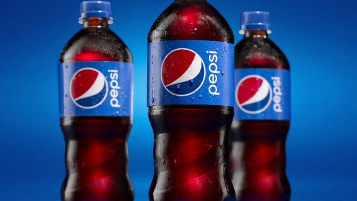
5. PEPSI
Clearly the most important—and riskiest—packaging redesign of the year involved the Pepsi bottle. Imagine being assigned to the team tasked with changing the look of the flagship product of one of the most-recognizable brands on earth. Our guess is that a lot of marketing and design folks at PepsiCo have been very stressed out.

(Photo credit: PepsiCo)
The good news for those folks is that they've been working with Mauro Porcini, the design chief that PepsiCo hired last year. Porcini is arguably the biggest talent working in brand design today. The better news is that the new Pepsi bottle (with its easy-to-hold swirled grip on the bottom, smaller globe logo, cola-colored border) is simply wonderful.
Would you like to see more food and beverage industry news and information like this in your inbox on a daily basis? Subscribe to our Food Dive email newsletter! You may also want to check out our Food Dive's look at what the Coca-Cola brand lost over a decade.